Union
Manager Portal redesign - Menu Configuration
2023
Industry:
Hospitality
B2B
SaaS
My deliverables:
User & Stakeholder Interviews
Platform Audit
User Flows
Wireframes
User Testing
The Project:
Union is a cutting-edge hospitality operating system developed to streamline operations in busy bars and restaurants. The system encompasses a Point of Sale (POS), a mobile app, and a manager portal, seamlessly working in together to modernize high-volume hospitality with an innovatively guest-led approach.
This case study outlines the improvements made to the Manager Portal and it's feature to create the menus that are displayed on the POS system – the device that displays menus and processes orders.
Discovery
WHAT IS A POS?
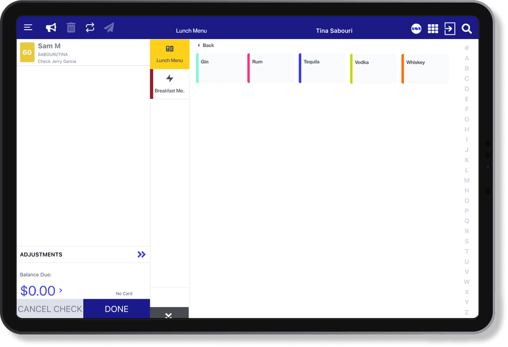
A POS stands for Point of Sale. It's the device used to display items people can order and process those orders to the directed prep area.
Within the Union system, there's 4 different types of POS interfaces they offer.
Physical
13' Tablet
10' Tablet
Handheld (mobile)
Digital
Online-ordering
AUDITING THE MENU FEATURE
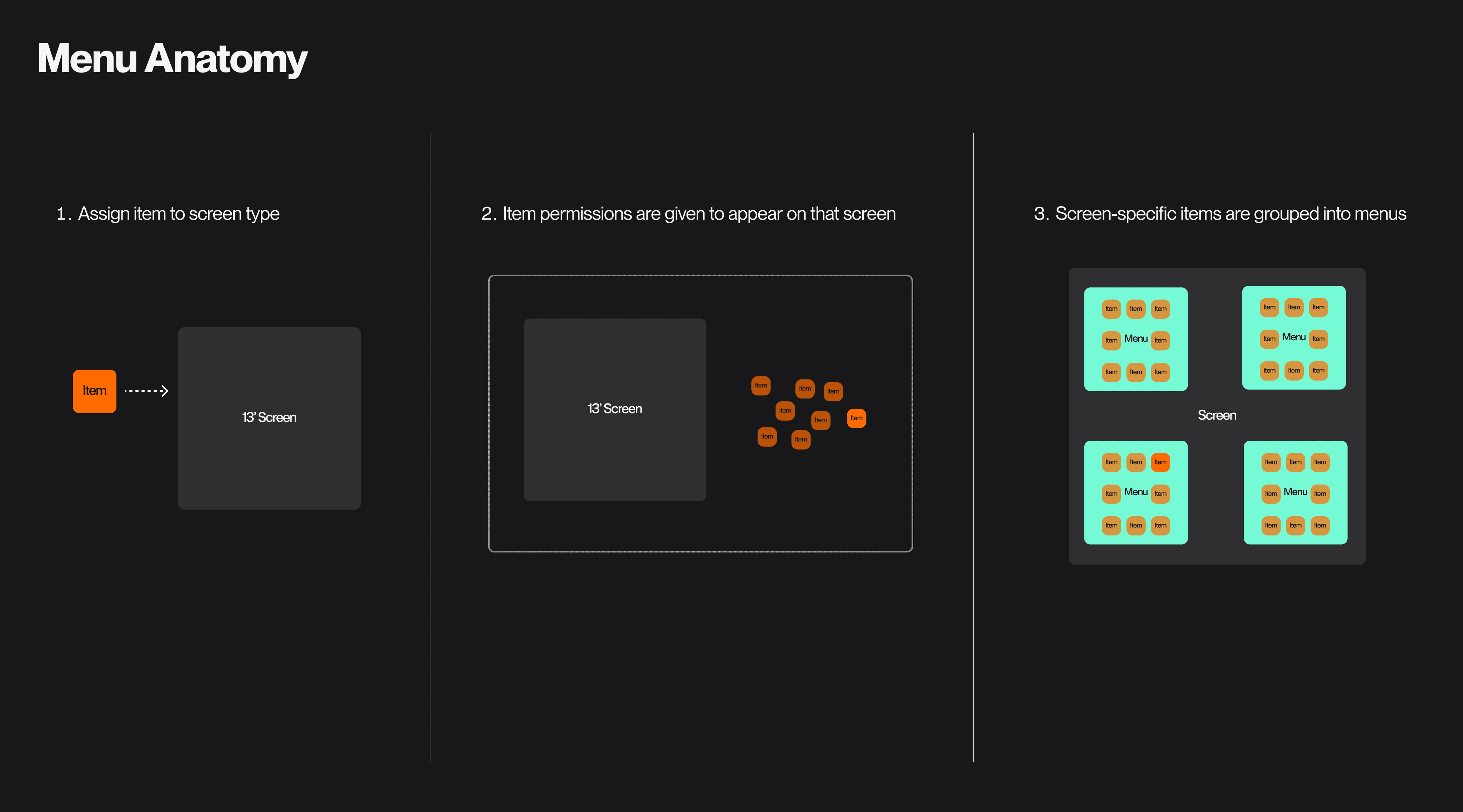
We began the product by conducting an audit of the Menu feature and understanding how an item displays on an POS Device.
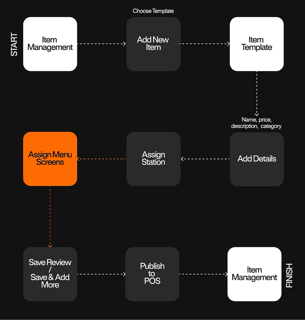
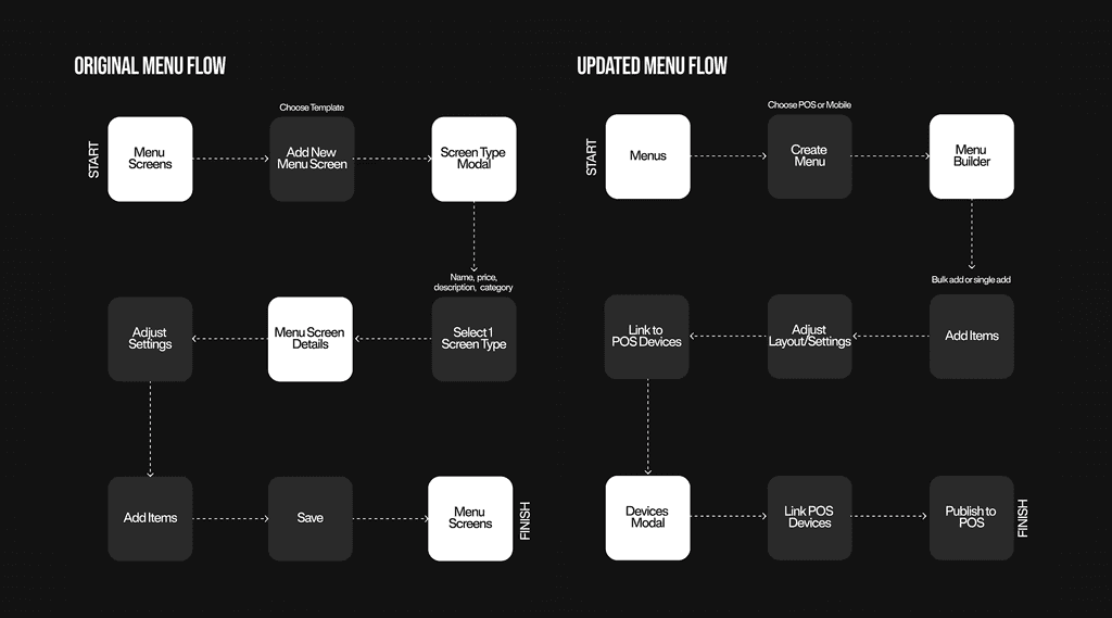
CREATE A MENU USER FLOW
To add an item to a menu, users must first add them to a specific screen. These screens are the tablets and/or handhelds places around a venue.
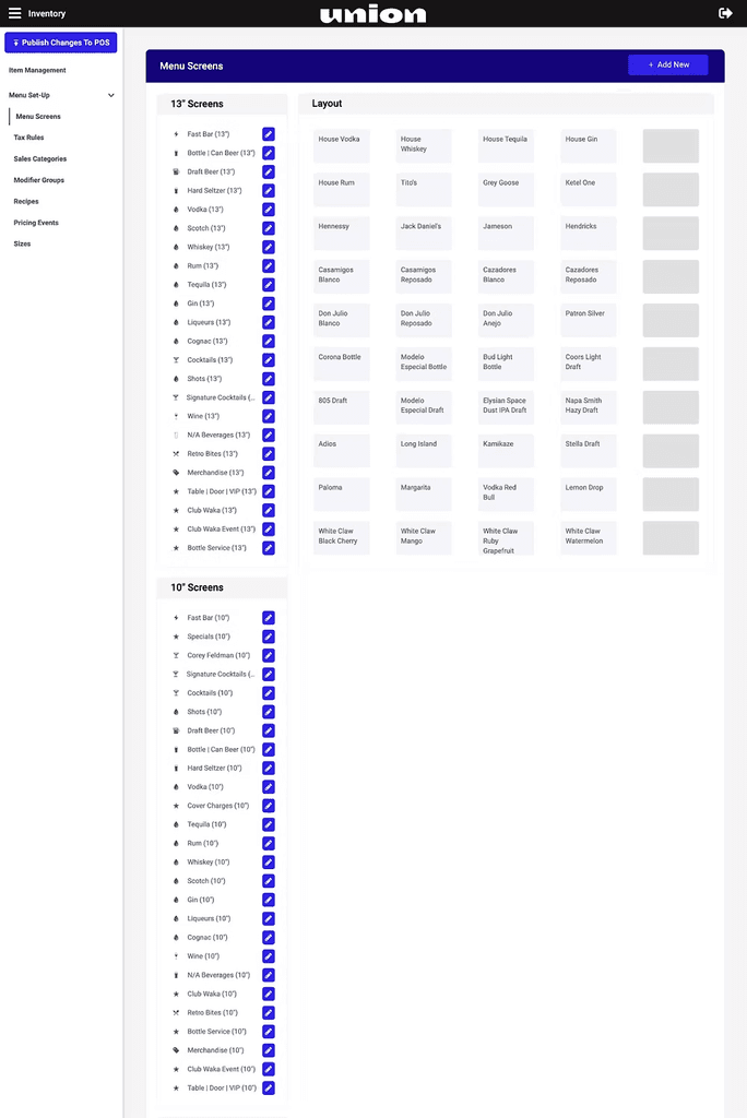
MENU CONFIGURATION SCREENS
Once users choose a specific device from their Screen list, they could configure the items into Menus.
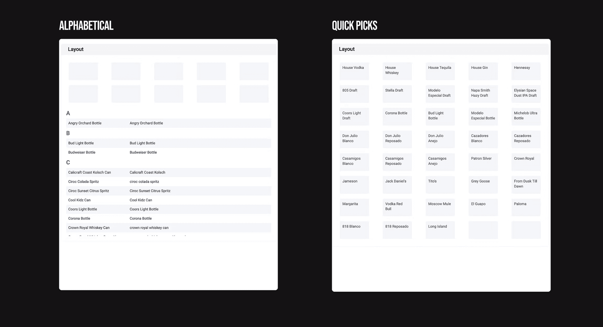
The Menu lay can be configured 2 way:
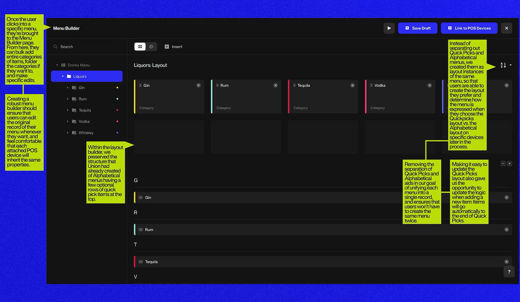
ALPHABETICAL:
Item are listed in alphabetical order, and when new items are added they are automatically placed in their respective order.
QUICK PICKS:
This was a clear favorite from clients. It allowed for users to create a custom configuration of each items in a menu. One common strategy was placing items in order of the popularity, having the most popular in the top right corner, mimicking how we read right to left.
UNDERSTANDING USER PAINPOINTS
We spoke to 7 different venue owners and 3 different stakeholder to understand any frustrations they had with the Menu feature.
CONCLUSION:
The users were getting frustrated because every screen acted as a separate device rather than part of a dynamic system – meaning users had to configure every POS device from scratch leaving room for erros.
A) Menu screens get missed in the process of creating a new item
“Nobody ever chooses the menu screens here. This is a commonly missed thing. Now I’ve built the item, but I haven’t chosen where it’s going to live on the point of sale or mobile app. People go look on their POS, it’s not there, so they call support and I have to tell them that they need to publish it to a menu screen."
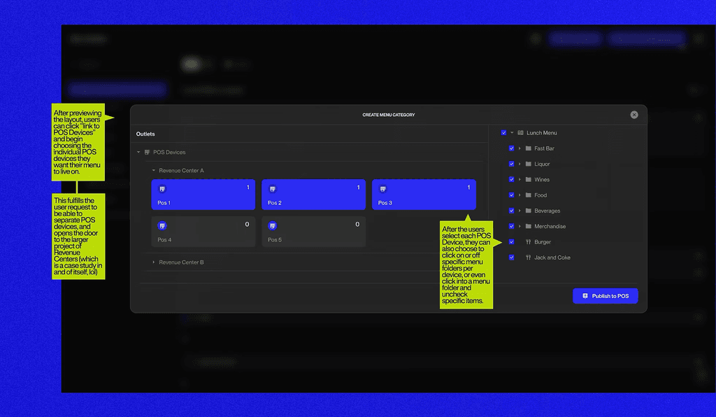
B) It's currently impossible to publish a menu to a single POS. Menus get published to all devices that share the same screen size.
“I want to be able to choose which menu screens live on which terminals. I want to publish an item to ONE POS, not all 13” screens at once."
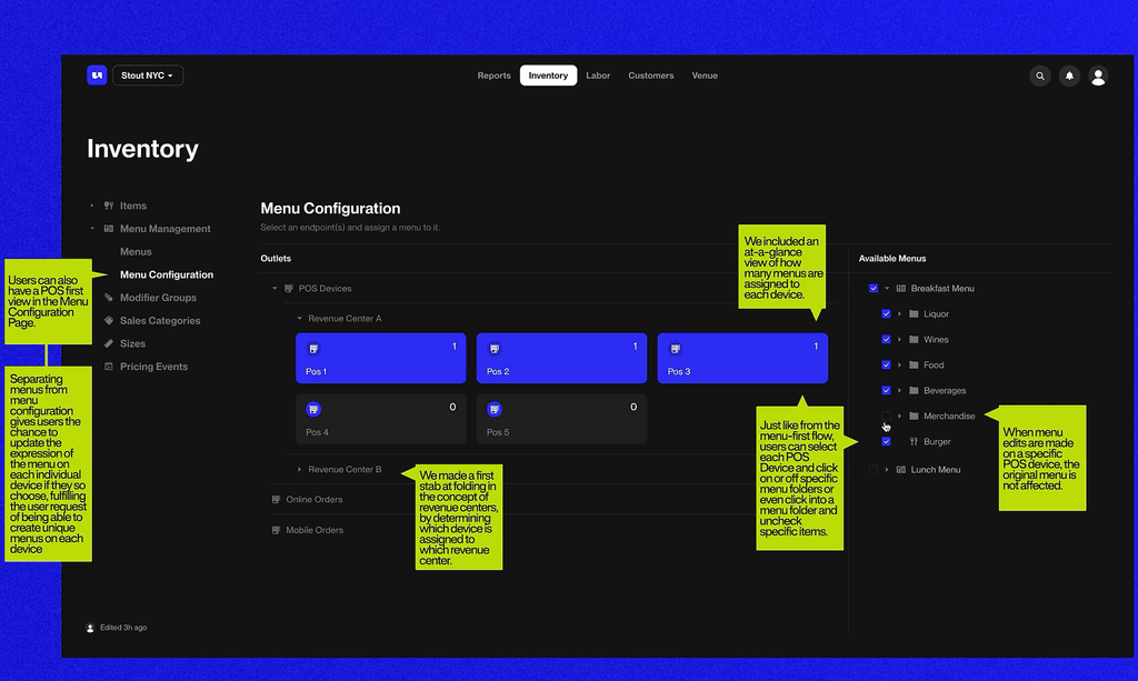
C) And because it's impossible to publish menus to a single device, venue owners can't separate their venue into smaller zones.
"Venues want to be able to split items by revenue centers, so that some items are only available on the patio, while other items are only available at the upstairs bar."
Define
PROBLEM STATEMENT
There is a missing step in the process of creating menus, and that's Menus themselves.
It was clear chatting to clients about their frustration of wanting to create a menu first, before adding it to a POS and we agreed. While we moved into the Define phase, we kept in mind the considerations of why Union first built it the way they did and optimized it with user needs.
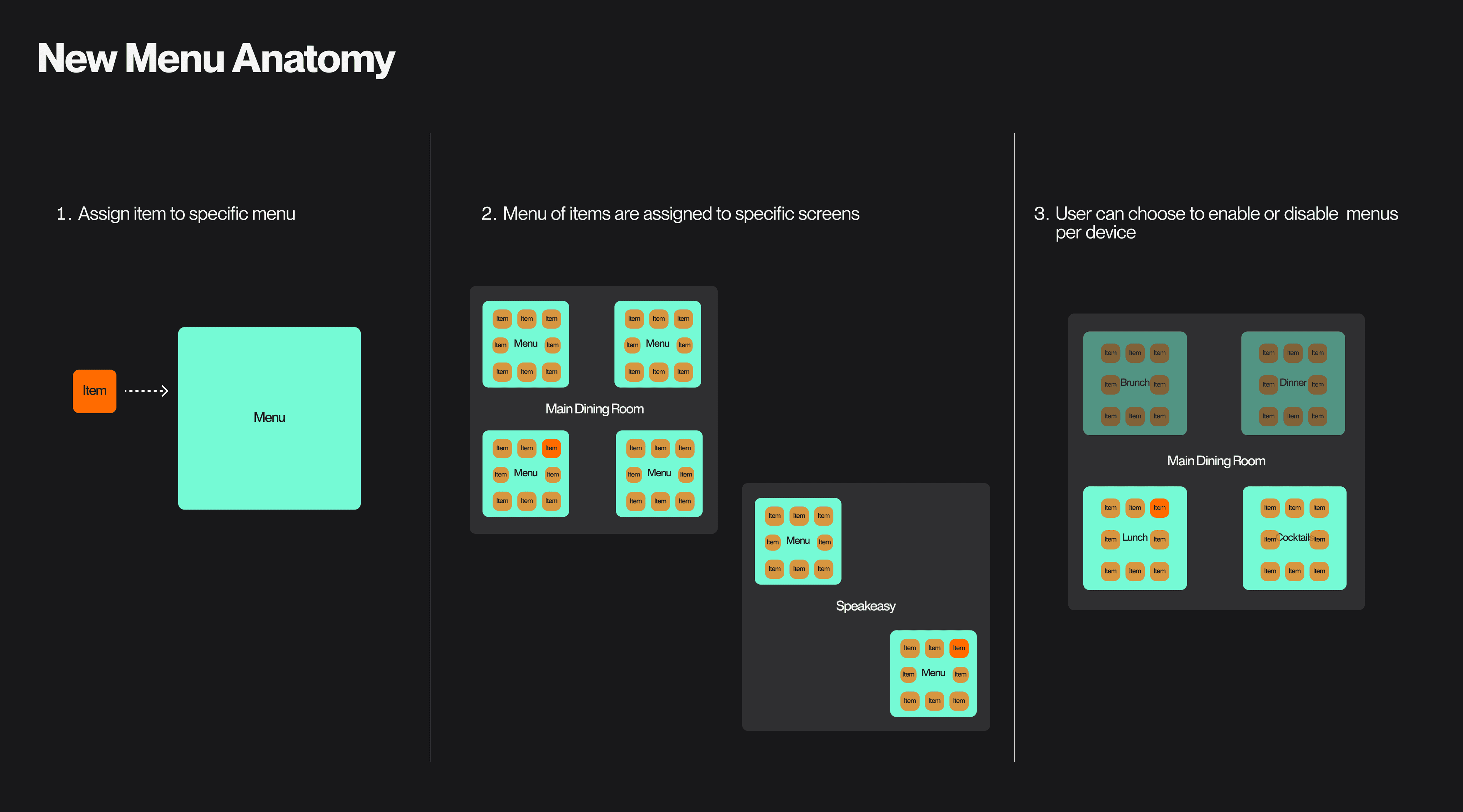
DESIGN CHALLENGES AND CONSIDERATIONS
It was clear chatting to clients about their frustration of wanting to create a menu first, before adding it to a POS and we agreed. While we moved into the Define phase, we kept in mind the considerations of why Union first built it the way they did and optimized it with user needs.
1
Union wants to maintain a separation between the items available on POS devices and the Union Mobile Menu
Reasoning being that there are some items they don't want people to order to-go. For example, a Sirloin Special that is priced by the ounce. They didn't want to responsibility to calculate the ounce and price.
2
The logic of adding an item to an alphabetical menu screen is easy, but users are required to configure the layout of the Quickpicks menu screens
Items being to sent to existing menus still need to be configured for their screen's Quick Picks.
3
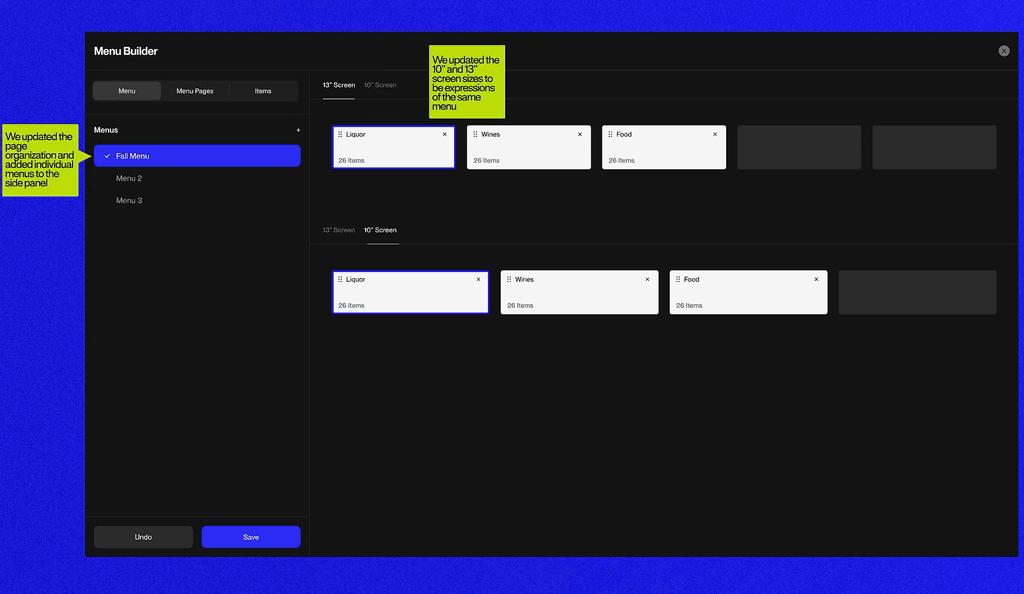
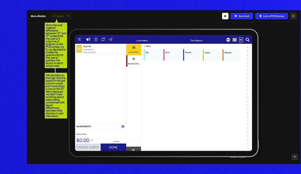
10" Screens and 13" Screens have different layouts
One screen allowed for 6 items per row, while the other only allows for 5. There needs to be a logic when sending a single menu to two different devices.
Deisgn
Round 1
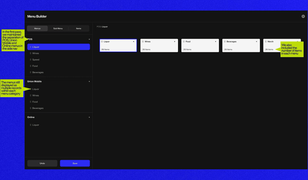
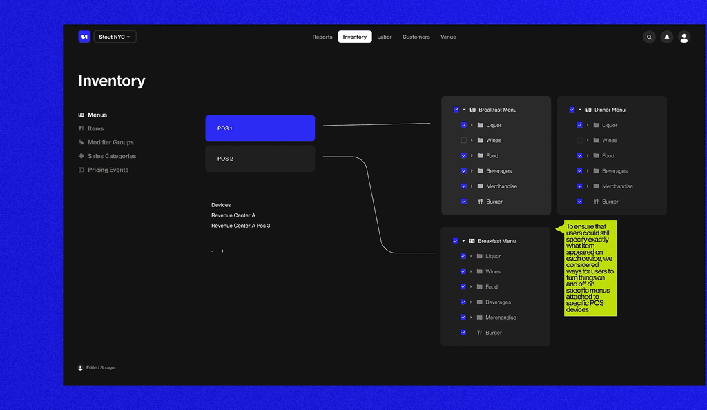
Round one was a good start, but we were still too attached to how the current that the exact items that they want to display on each device can be displayed. We started considering alternate ways to organize the nav.
Round 2
Round two was an improvement as we started to move away from the way that Union had the pages laid out, but we still hadn't nailed how to include the Alphabetical and Quick Picks views, or how the Menu Builder screen should exist within Inventory. We also began to consider how the menus and POS devices might exist in relation to the new concept of Revenue Centers.
Round 3 - Final Iteration
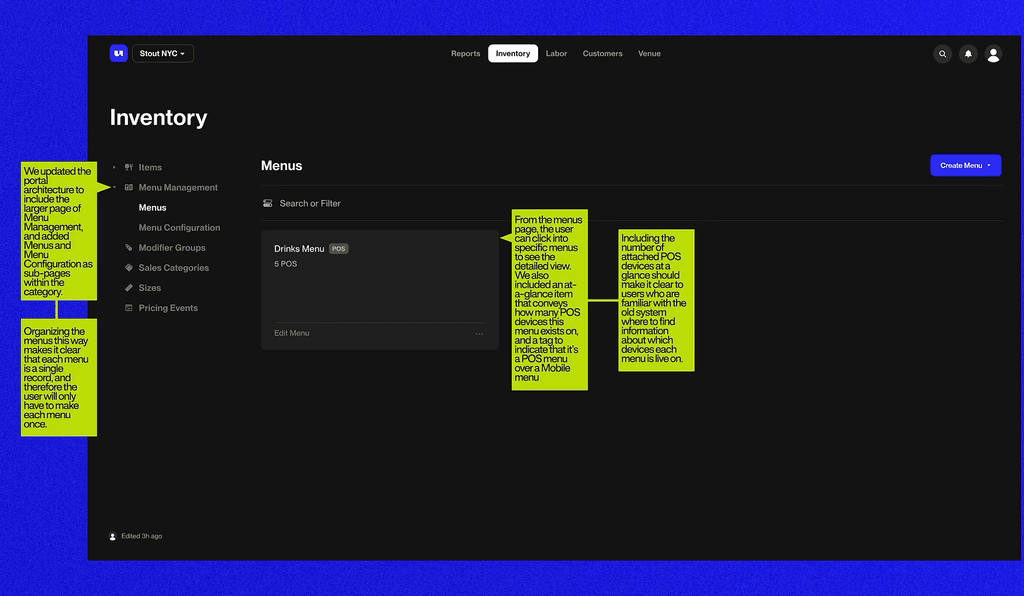
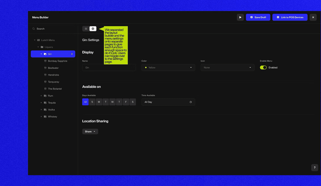
The current iteration addresses all of the problems surfaced in the evaluation phase of the project, and ties neatly into Revenue Centers.
Final Flows
After we nailed down all of the logic in the wire framing process, we codified it by creating an updated user flow.
